


FEATURED INTRO
FEATURED CAMPAIGNS
A closer look at a few key projects, from the integrated live-action data visualization of IBM, to the world-building animation and visual effects of Target and Amazon — and a lot in-between.
I seek to bring humanity and originality to these larger-than-life visuals — and to convey invisible ideas in beautiful new ways.
IBM THINK EXHIBIT
Case Study #01
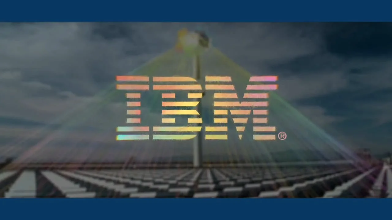
IBM
"THINK" EXHIBIT
AN IMMERSIVE EXPERIENCE CELEBRATING IBM'S 100-YEAR ANNIVERSARY
IBM THINK EXHIBIT
Case Study #01
IBM
"THINK" EXHIBIT
AN IMMERSIVE EXPERIENCE CELEBRATING IBM'S 100-YEAR ANNIVERSARY
Overview
The IBM “Think” exhibit is a sprawling, multi-platform interactive experience echoing IBM’s ethos – exploring how our world works, and sharing insights that elevate our understanding of how we can make it work better.
As the Senior Creative Director for Mirada on the project, I led a team of Creative Directors, Art Directors, animators, designers, programmers, writers, and other artists to create this celebration of innovation. The project consisted of a 10-minute film, a massive data visualization wall, and large-scale interactive touch screens, all connected by the concept of visualizing how progress happens.
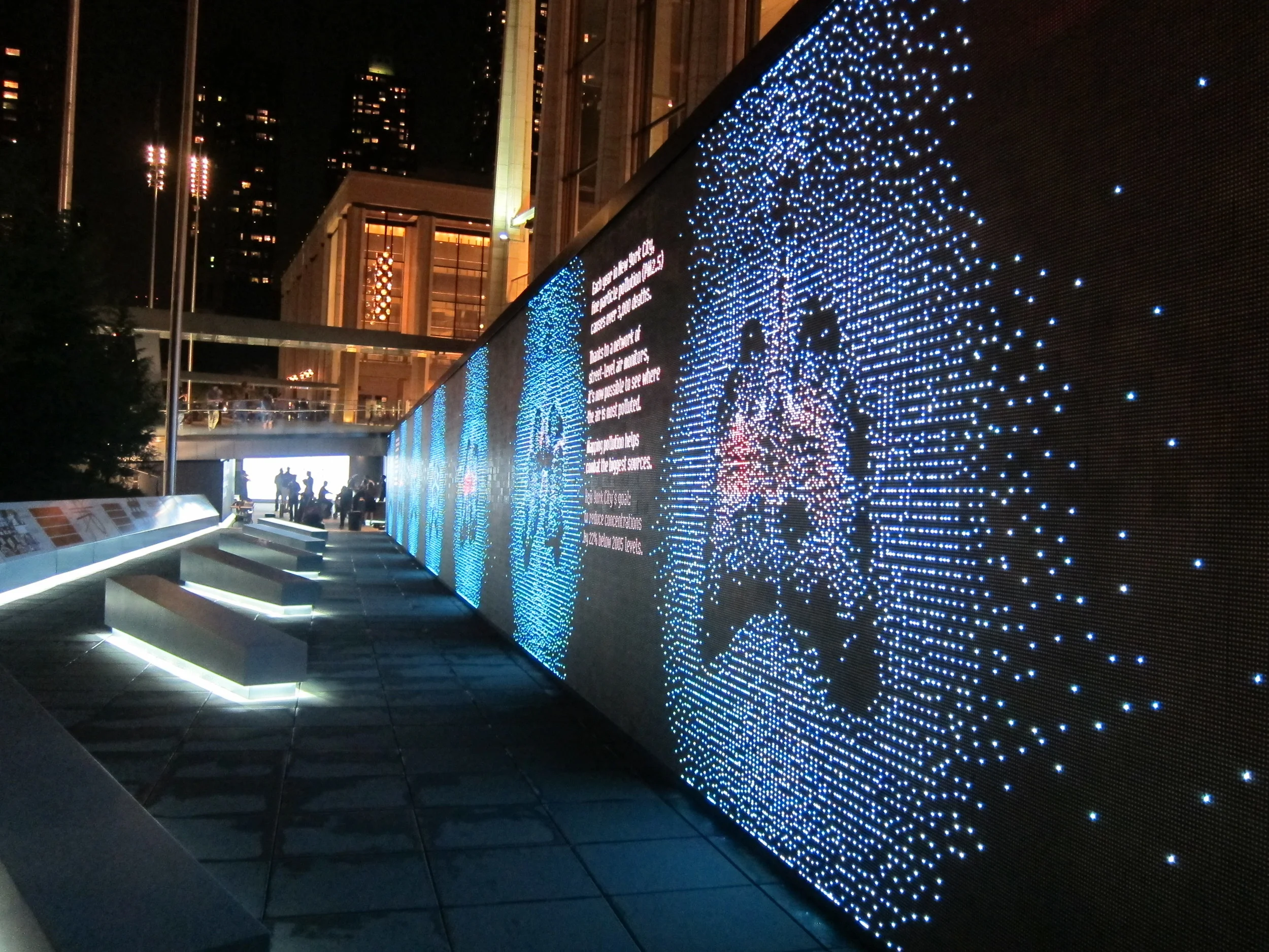
The project, conceived by SY Partners and IBM, set out to celebrate IBM’s centennial in the spirit of the historically renowned IBM Pavilion at the 1964 World’s Fair. Every experience involved pushing the boundaries of technology and linking systems that had never been used together. From the 123-foot-long real-time data wall to the custom-built camera system used for the film, every step demanded innovation, testing, and the talents of a wide variety of artists and technologists.
The result was a groundbreaking exhibit that debuted at Lincoln Center in New York City, receiving numerous awards and national coverage in:
New York Times, Fast Company, Huffington Post, Creativity Online
IBM Centennial Film
The THINK film at the heart of the exhibit highlights the patterns that great thinkers follow to affect positive change in the world around us. I collaborated closely with my team and creative leaders at SYPartners to originate a new visual language that fused intelligence, progress, and – because we hope that technological advancements will ease suffering and make our lives better – hope.
We captured more than 300 hours of live-action scenes from a dozen countries, focusing on highlighting the paradigm-shifting advancements in technology and science, and how they affect individual lives. The shoot utilized a custom three-camera rig designed to create a more immersive experience for viewers, who saw the film on 40 monumental 85-inch, dual-sided HD screens configured to create a 360-degree experience.
The design and visual-effects work was equally epic, with an intricate-yet-poetic design language representing exploration and progress, custom-created to match the underlying ideas and movements of each theme. Likewise, we created entirely CG passages, such as a space sequence that pays homage to the classic Eames film Powers of Ten by taking us from the cosmic scale to the microscopic scale in 2 ½ minutes. Through it all, our mission was not just to create great visuals – but to create visuals that enhanced the emotional, conceptual, and intellectual experience of the film and exhibit.


Data Wall


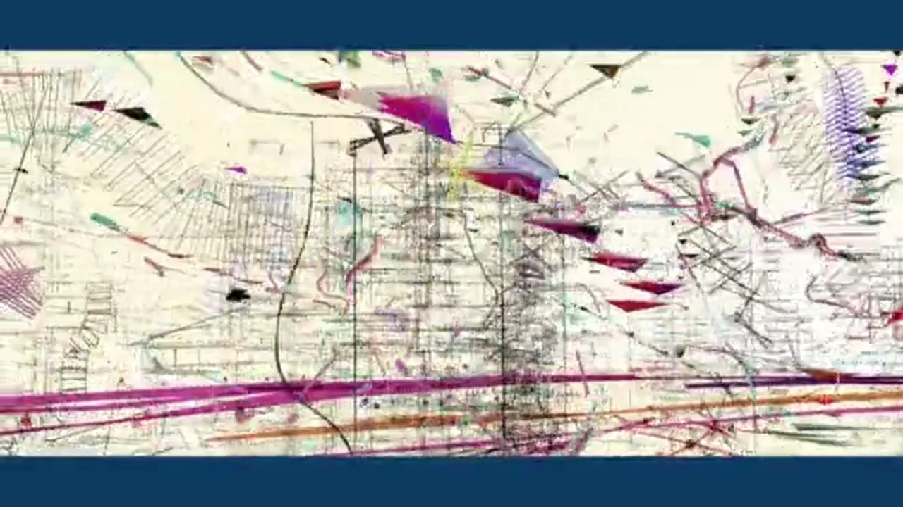
In addition to applying our new visual language to the film, we also used it to create an interactive data visualization wall that turned real-time environmental data into intricate and beautiful design patterns. This monumental 123 x 12 foot, 1.2 million pixel LED wall was designed both to work as a pure aesthetic experience, and also to reflect the themes and story elements visitors would encounter once inside the film. For instance, the real-time visualizations of actual traffic patterns and air quality illustrate how data analysis helps the city identify flaws in its utilities infrastructure and, ultimately, explore solutions for operating more efficiently.
Deep Dive Interactive


After the THINK Film concludes, each 85-inch screen reveals itself to be an interactive touch platform for visitors to navigate and explore the themes of the film. One of the main challenges we had to answer in this section was in transforming a passive visual language into a visual style that inspires the viewer to become an active explorer.
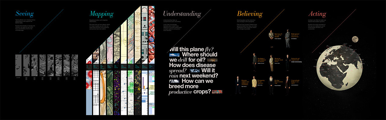
At the heart of the message we shared was IBM’s paradigm for how progress unfolds with the principles of SEEING, MAPPING, UNDERSTANDING, BELIEVING and ACTING. Each section required its own design, animation, and interface – unified, but also reflecting the unique nature of that step in the process.
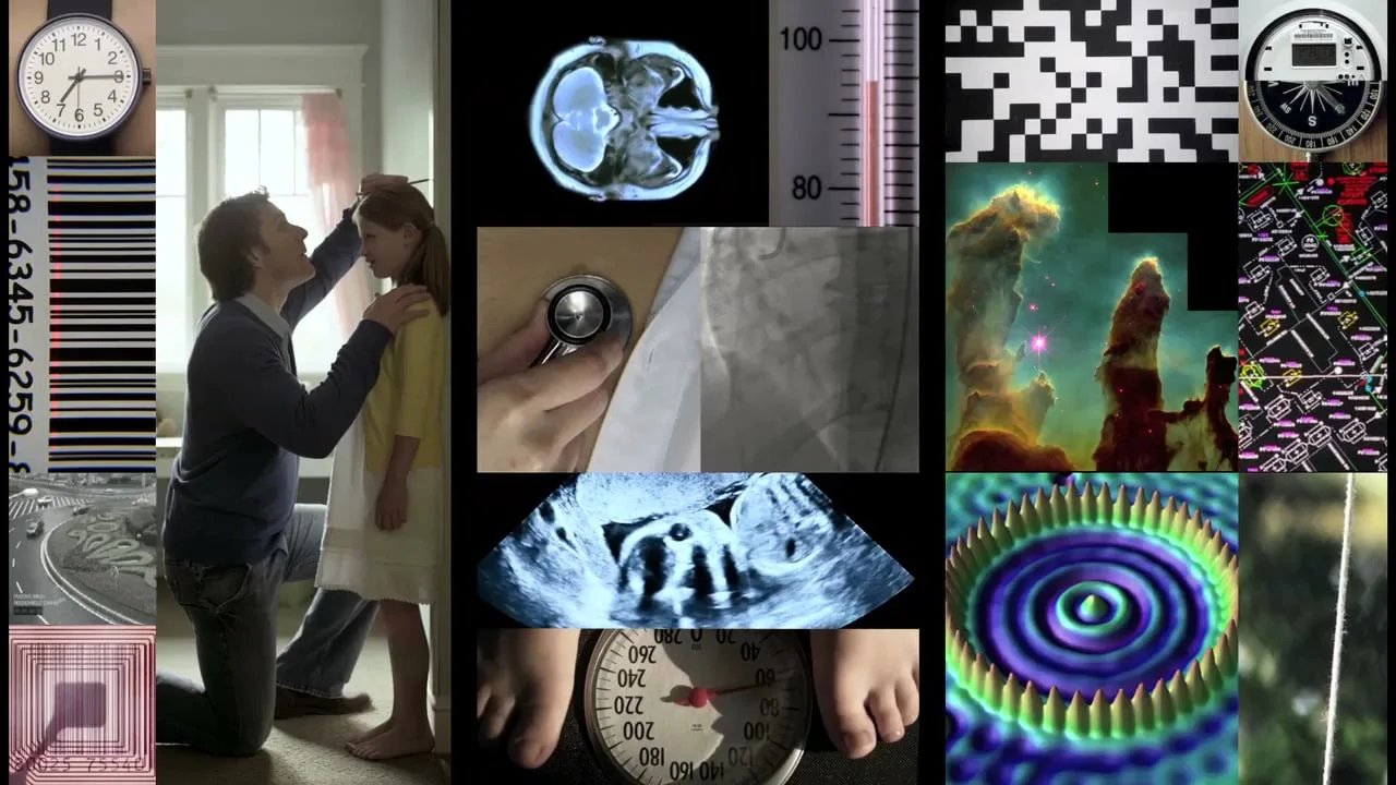
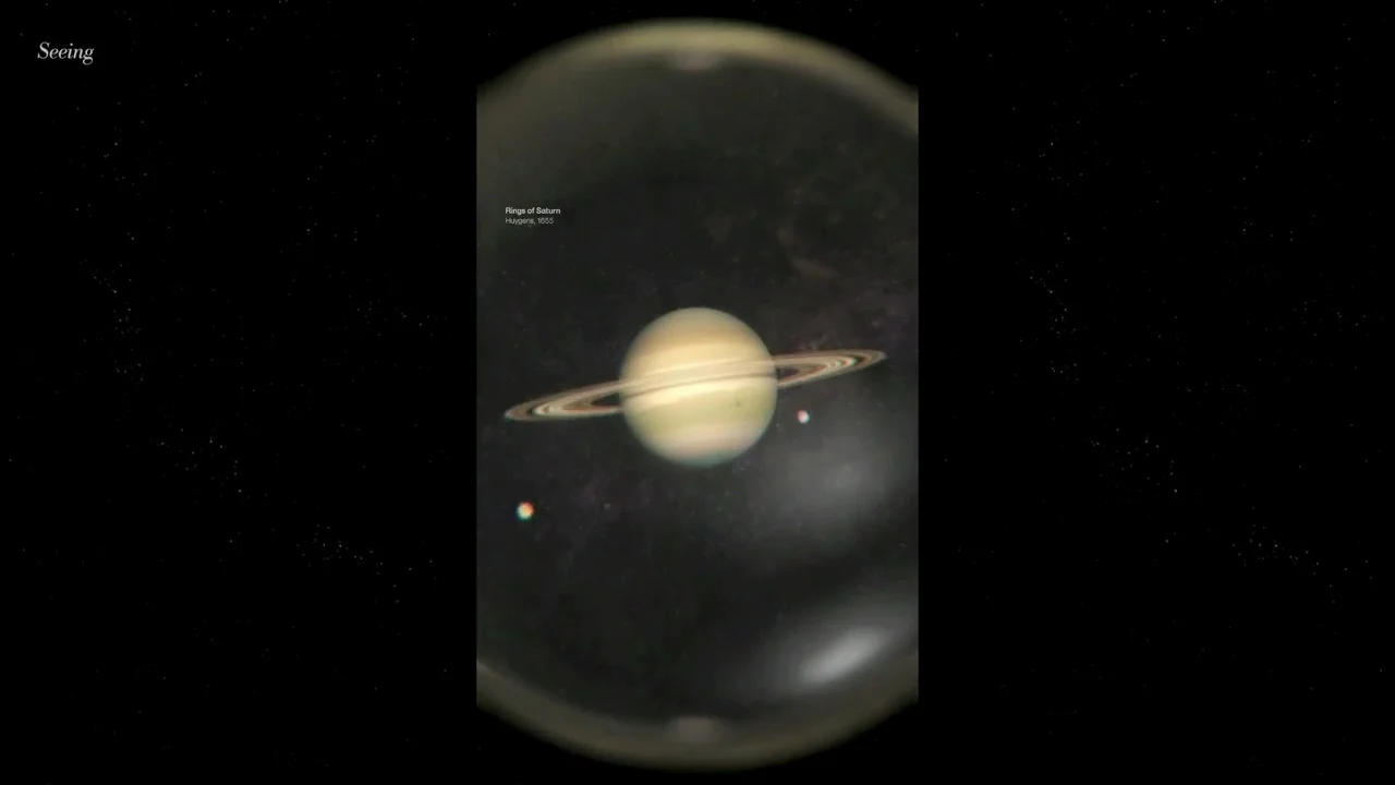
SEEING presents an interactive timeline reaching back through history, representing an overview of where science has been, and gathering data. MAPPING allows for an active journey through images from the past and present that illustrate how maps organize information, helping to advance commerce and science. UNDERSTANDING enables visitors to chart the story of what humans do once they have information – organizing it, and projecting where developments might lead. BELIEVING features life-size scale interviews with leaders in social science, medicine, and economics – illustrating how belief and communication can affect change. Finally, ACTING explores the question of what we do with all this information. An interactive globe appears with nearly 100 pins, each linking to a robust transmedia case study of a current real-world project that illustrate progress made possible through the use of technology, research, information – and the inspiration of imagination, vision, and action.
IBM SMARTER PLANET
CASE STUDY #02
IBM SMARTER PLANET
DATA-INSPIRED DESIGN FOR BROADCAST, DIGITAL, AND PRINT MEDIA
IBM SMARTER PLANET
CASE STUDY #02
IBM SMARTER PLANET
DATA-INSPIRED DESIGN FOR BROADCAST, DIGITAL, AND PRINT MEDIA
Overview
The IBM “Smarter Planet” campaign was a global branding initiative consisting of broadcast, print, outdoor, and online messaging, all highlighting case studies of IBM’s enterprise solutions. It stands as one of the earliest wide-release campaigns utilizing beautiful data visualization as its foundational concept. As the lead Creative Director, I led a team of designers, coders, and visual effects artists, working closely with Ogilvy to develop the campaign’s visual language across media. The core challenge was to innovate a visual style that conveyed the idea of “smarter planet” solutions without words. In addition to leading other designers, I took a front-line position in developing a new form of data visualization that sought to combine art, science, mathematics, and humanity. This included creative directing design stills, guiding a team of 3D animators, and leading a team of programmers to create custom code that helped us to create a never-before-seen level of interaction between design and live-action footage.
Data baby
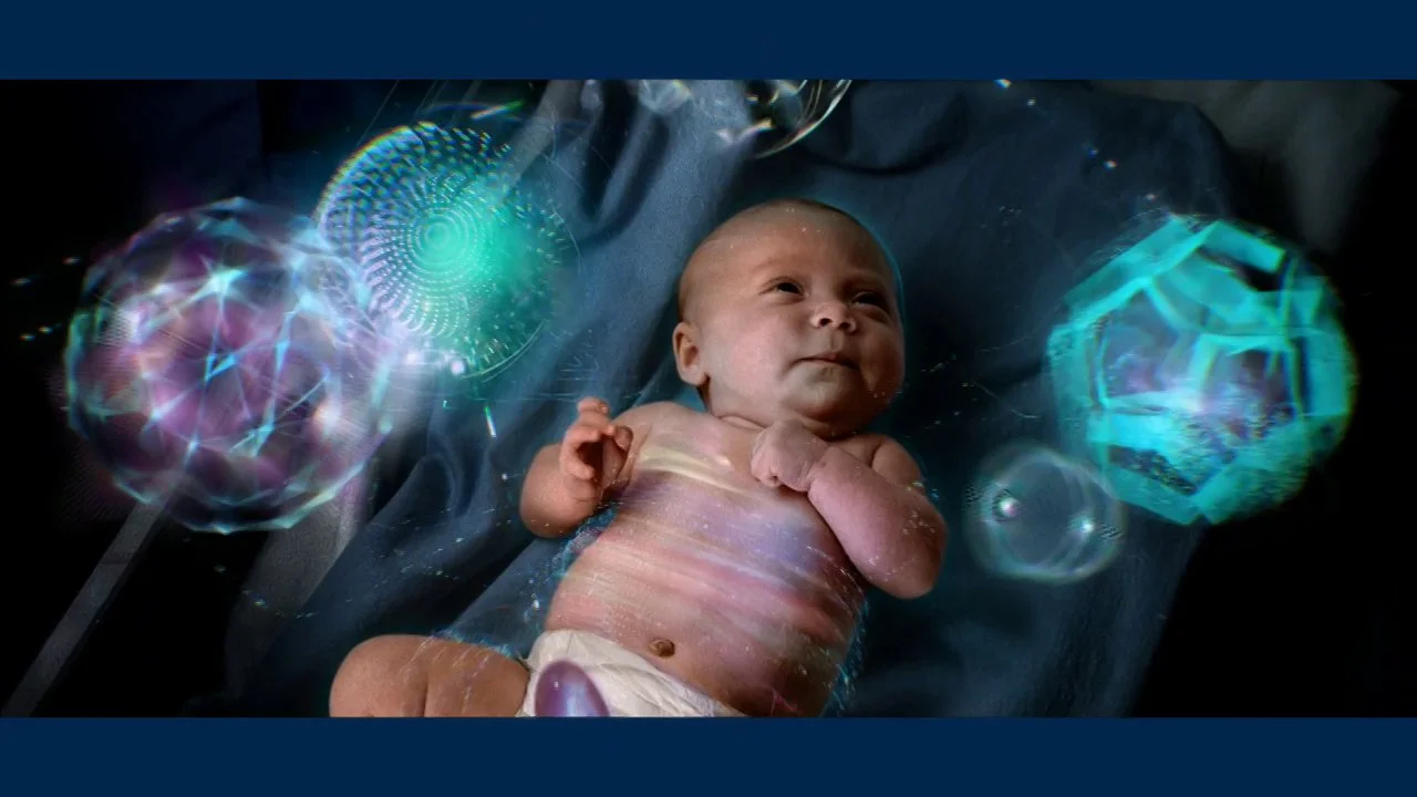
Specifically, I oversaw every step of the creative process in developing and finishing the broadcast spot IBM “Data Baby,” in which delicate data viz interacts with a newborn baby, communicating how IBM’s health systems have helped to improve newborn health. Likewise, I conceived, creative directed and shepherded the visual style for IBM “Energy,” in which the concept of energy efficiency becomes visible as colorful curves interacting with live-action footage. The theme of visualizing innovation and data extended into many print and online uses, with each new usage requiring a customized application of the design principles I played a key role in creating.


Much like the broadcast and digital components of this campaign, the print ads featured actual raw data, beautifully visualized through a combination of mathematics, programming, design, and animation.

TARGET
Case Study #04
TARGET
THREE BROADCAST CAMPAIGNS THAT ILLUSTRATE TARGET'S CREATIVE DIVERSITY
TARGET
Case Study #04
TARGET
THREE BROADCAST CAMPAIGNS THAT ILLUSTRATE TARGET'S CREATIVE DIVERSITY
Overview
I’ve enjoyed a wide-ranging collaboration with Target, working with the company’s in-house creative agency to announce the brand’s grocery launch with an all-animated spot, creating fashion-oriented beach spots for their high-profile summer campaign, and promoting three major albums with a trio of music-video-inspired broadcast spots.
Bullseye

In the Target “Bullseye” campaign, Target’s iconic red bull’s eye logo opens to reveal a world of industrious animated characters working behind-the-scenes to get ready for Target’s new grocery department. As creative director on the campaign, I guided the entire process, from original client presentation to character creation, storyboards, animation, style, and delivery.
Target Summer Campaign


In striking contrast, the Target “Summer” campaign was entirely live-action and fashion-focused. My role as creative director started with the earliest concept creation and presenting new concepts to the client based on their original idea. The two spots feature a bright red beach changing tent that playfully introduces an endless stream of characters, often bringing people into frame with clever transitions and subtle visual effects. I developed the spot’s fashion-oriented look and led the visual effects team in bringing the concepts to life, while working closely with the client throughout the entire process.
House of Red
Target’s “House of Red” campaign set out to launch three major albums – from Taylor Swift, Pink, and No Doubt – with vivid visual commercials inspired by high-concept music videos and featuring each artist in a central role. I creative directed the campaign, collaborating to create the three visual concepts and leading the design team to develop those ideas into a cohesive presentation for the client and artists.
Each spot was conceived to be as dramatically different as the song and artist we featured.
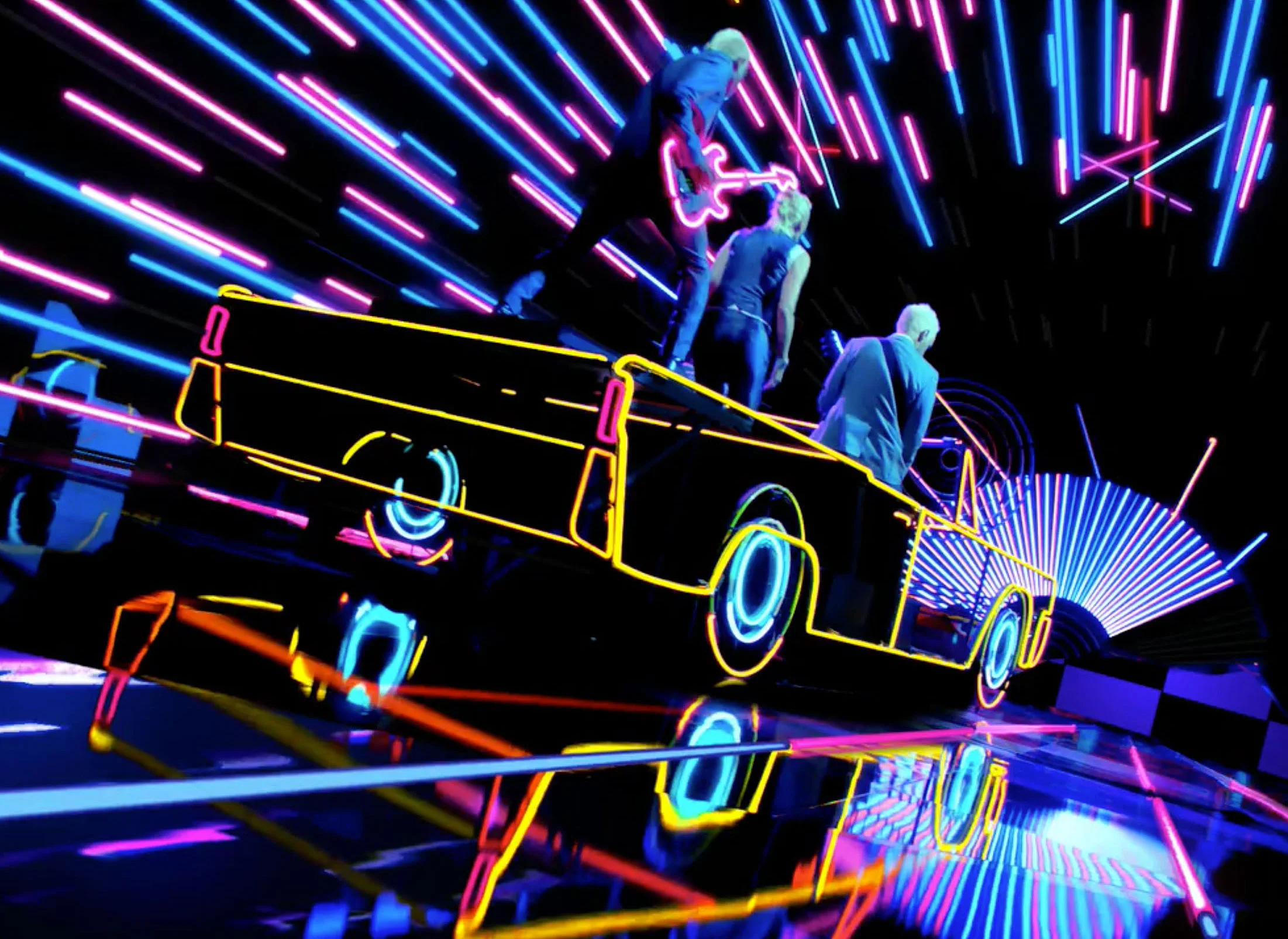
For “No Doubt,” we created our own “electric street chic,” including a neon-outlined convertible road-tripping through a neon world – paying homage to the line art of the band’s album cover.
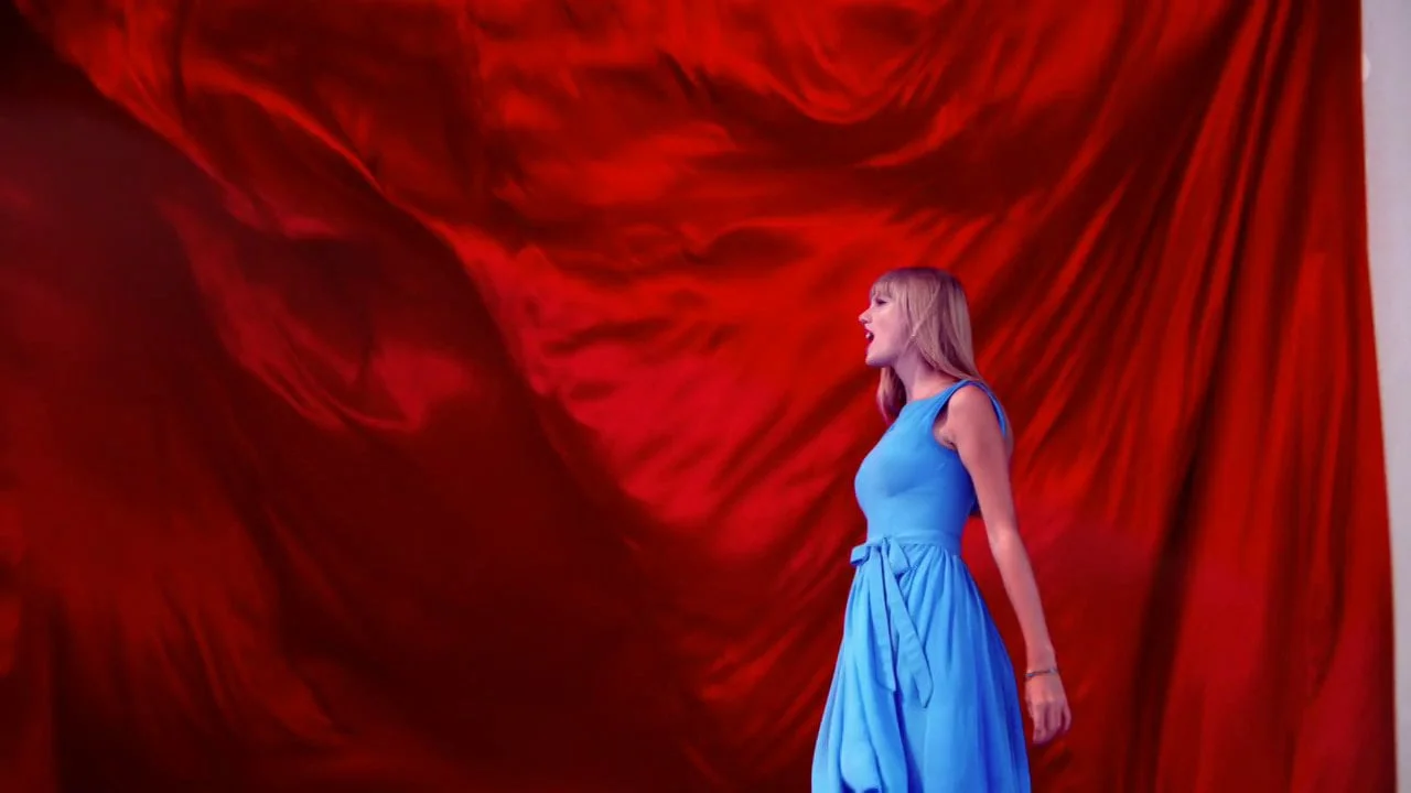
The Taylor Swift “Red” spot features Taylor starting in a white-walled foyer, but soon dramatically unveiling a world of red silk walls and flowing ribbons all around her.

And finally, we created a highly stylized celestial theme for Pink, setting her as the center of a universe of orbs, and escalating the color, motion, and energy to reflect the song’s uplifting themes.
AMAZON
Case Study #05
AMAZON
AN EPIC INSTALLATION AND A MUSICAL CELEBRATION OF AMAZON PRIME
AMAZON
Case Study #05
AMAZON
AN EPIC INSTALLATION AND A MUSICAL CELEBRATION OF AMAZON PRIME
Prime 10th Year Anniversary
Amazon set out to mark Amazon Prime’s ten-year anniversary by celebrating all the lesser-known benefits of the service with a huge, Broadway-style song-and-dance extravaganza that needed both in-camera choreography and visual effects to capture the scope of the concept. I collaborated with the director in the pre-concept phase and throughout the shoot in order to create a seamless mix of live-action elements, and visual effects, which included photoreal CG drones, epic set extensions, integrated conveyor belts, and animated marquee signs.
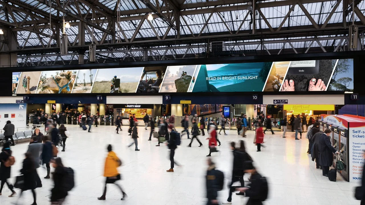
Waterloo Station
My collaboration continued with Amazon as the lead creative on a large-scale installation piece marking the launch of the Kindle Paperwhite. The installation went up in the Waterloo station, where the high-definition digital display measures 131’ x 10’ and features of daily traffic flow of 300,000 commuters. This epic canvas became the setting for a panoramic, larger-than-life montage of Kindle owners traveling the globe with their trusty e-reader in tow.
NIKE
Case Study #06
Nike Golf
ENGINEERING INNOVATION MADE VISIBLE FOR TWO TV AND PRINT CAMPAIGNS
NIKE
Case Study #06
Nike Golf
ENGINEERING INNOVATION MADE VISIBLE FOR TWO TV AND PRINT CAMPAIGNS
Overview
"What does brainstorming look like?” That was how I framed the challenge when asked by Wieden+Kennedy Portland and Nike to visualize the thoughts and mechanics of the creative process of two engineers behind Nike’s evolving golf line. I served as Creative Director on this campaign, which spanned broadcast and print, and integrated the skills of 3D artists, designers, coders, and compositors into a seamless visual experience. The spots incorporate real-life engineering data into design that interacts fluidly with the footage, representing the thought process, the science, and the imagination that goes into Nike’s efforts to improve golf equipment.
Sumo
TV Spot


Print Ads
One Ball
TV Spot


Print ads
See more of my Creative Directing work in my SELECT PROJECTS gallery